
Portfolio Operations
The underperformer.
Rhino finds it.
Continuous submeter data across your entire portfolio. Catch equipment faults within hours, not quarterly reviews. Rank every building by energy intensity. Know your peak demand before it exceeds contracted capacity and triggers a fine.
15 min
Data update interval: every fault leaves a trace
30–60 days
How long the same fault hides in a utility bill
All utilities
Electricity, gas, water, and heat in one portfolio view
40+ countries
Active across portfolios worldwide
The problem
Your portfolio has blind spots.
When you manage one building, a data gap is inconvenient. When you manage forty, it compounds across every site. A boiler fault at building 17 stays invisible until the invoice. Your worst-performing asset on energy intensity sits unidentified for a quarter. Your peak demand exceeds contracted capacity at three sites, and no one knows which tenants or systems are responsible.
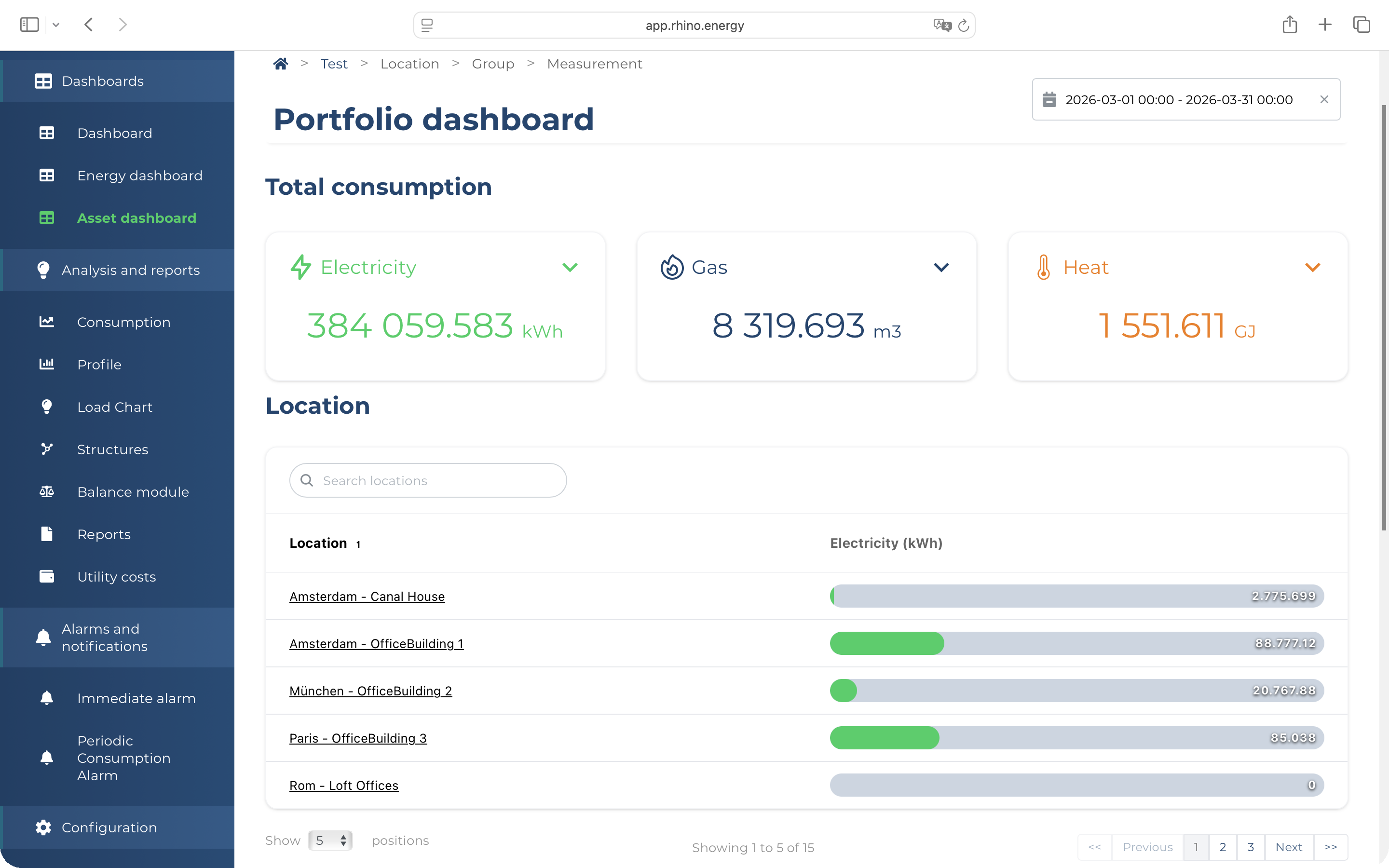
Portfolio-scale decisions: which building to retrofit first, where to allocate grid capacity, how to defend your ESG numbers, need interval data, not month-end summaries. Rhino makes every meter across every site visible at 15-minute resolution, in one view.
See how the platform worksFaults
caught within hours of appearing in consumption data, not weeks after the bill arrives
kWh/m²
the intensity metric that lets you rank every building in your portfolio on the same basis
Peak demand
tracked at 15-minute intervals per site, so you know your contracted capacity exposure before it becomes a fine
Fault detection
Catch the fault in hours. Not next month's invoice.
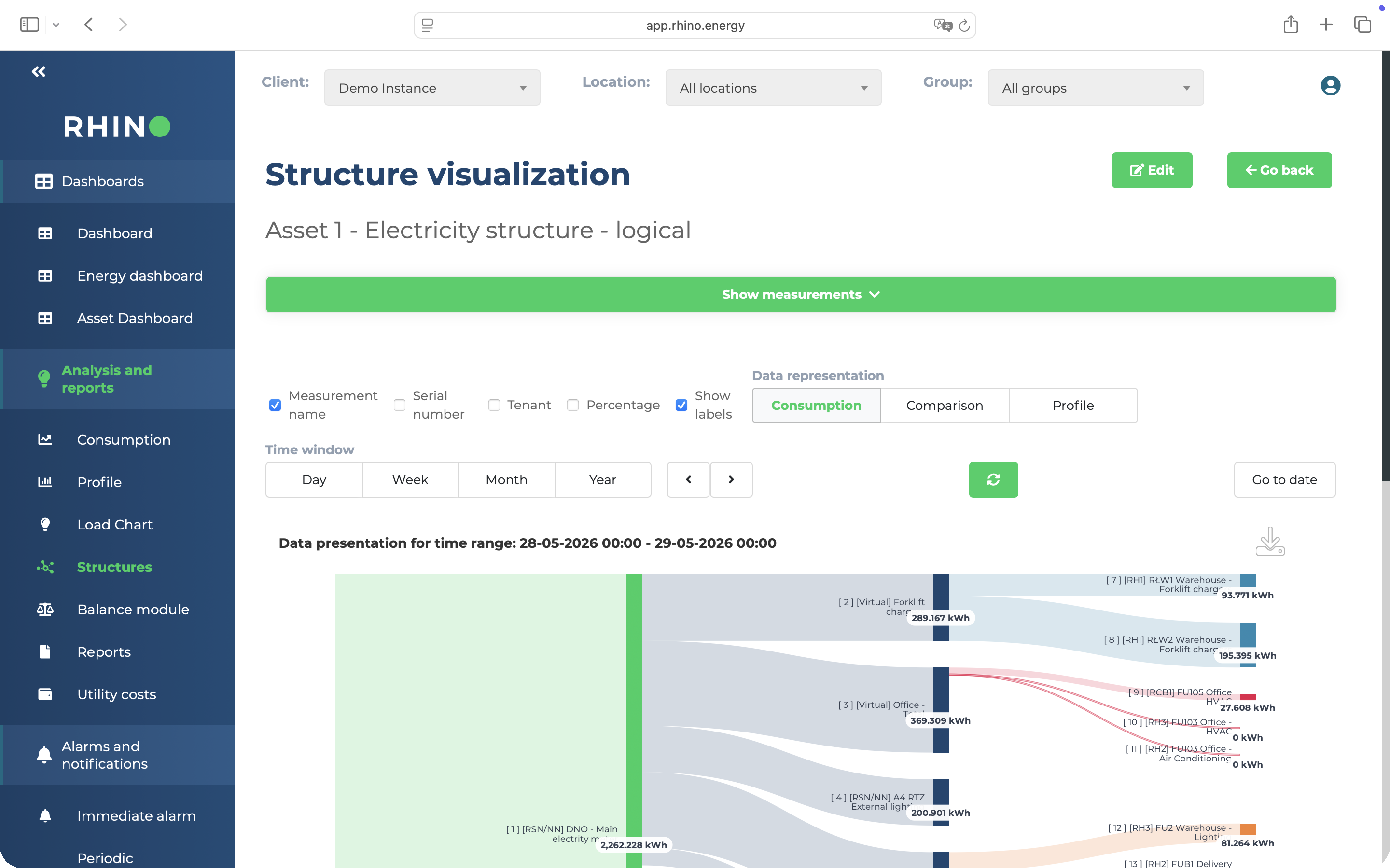
Every equipment fault, water leak, and baseload drift leaves a signature in consumption data before it shows up in a utility invoice. Rhino reads those signatures continuously, across every building in your portfolio.
Baseload drift alarms
Rhino builds a continuous baseline for every meter and flags when consumption drifts above it. A boiler that never fully switches off, a refrigeration unit running 12% higher than its seasonal norm, an HVAC system short-cycling through the night. Each one appears as an alert, not as a line on next month's bill.
Explore the platformLeak and equipment fault signatures
Water meter step changes indicate a running leak. Refrigeration compressor overcycles point to a failing seal or refrigerant loss. Hot-water recirculation losses show up as overnight gas consumption that should be near zero. Each fault type has a distinct consumption pattern. Rhino recognises them automatically across every utility.
See Cost ReductionPortfolio-wide anomaly view
One dashboard. Every site. Any building running above its historical baseline appears flagged at portfolio level, so your operations team does not need to drill into individual meters to find the problems. You see the whole estate at a glance and investigate only where the data points.
See the platform
Portfolio benchmarking
Every building, ranked. Capex goes where it earns.
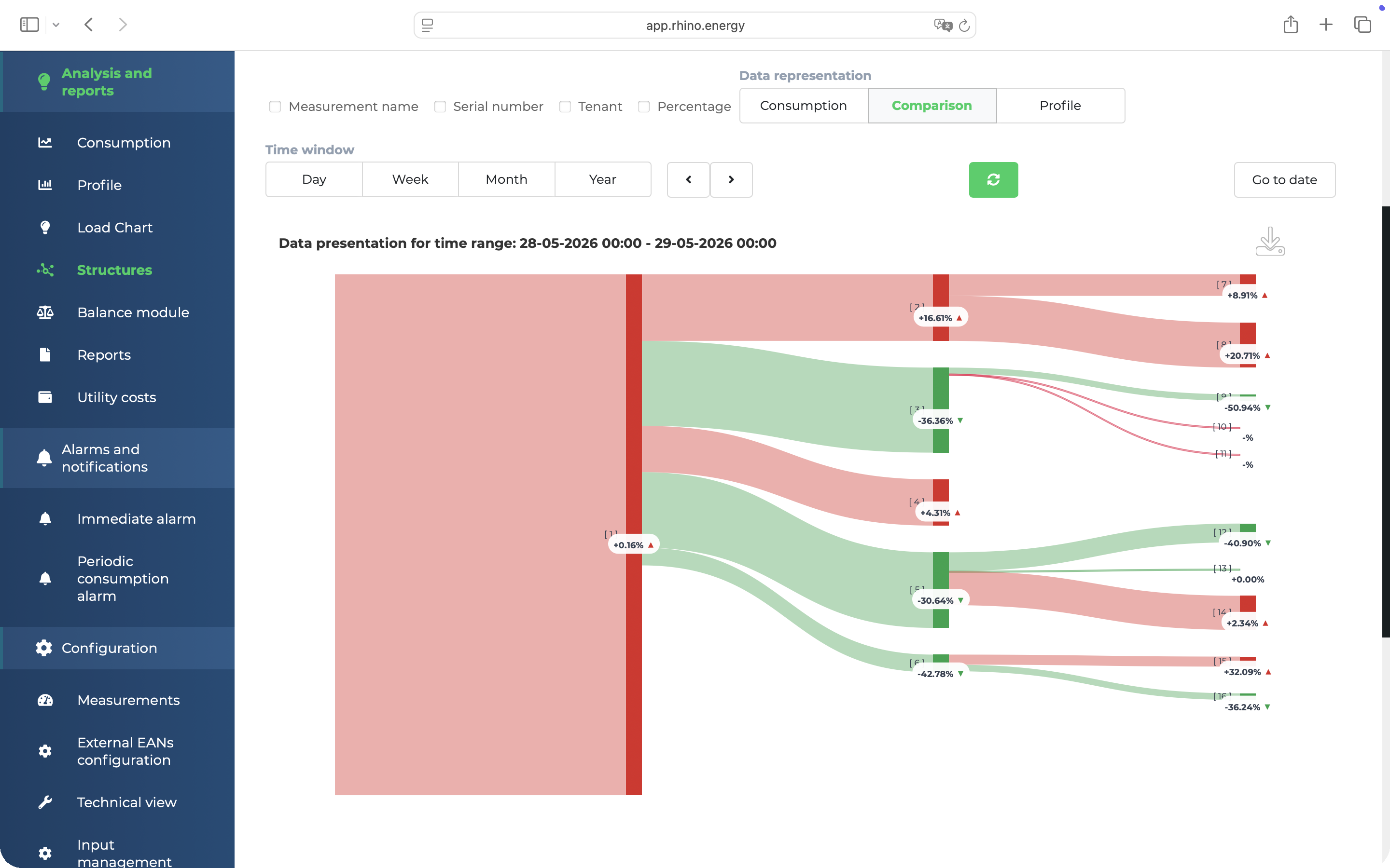
When every site reports at the same granularity, comparison is straightforward. Identify which buildings sit in the bottom quartile on energy intensity, direct retrofit investment there first, and verify the savings landed.
Per-asset kWh/m² benchmarking
Normalise consumption across every site in your portfolio to a consistent intensity metric. kWh per m², kWh per occupied room, or any other denominator your asset class uses. Every building gets a comparable score. The ones at the bottom of the ranking tell you where to look first.
See Cost ReductionTarget retrofit capex at the right asset
When you know which buildings sit in the bottom quartile on energy intensity, you know where retrofit investment pays back fastest. Filter by utility type to isolate gas-heavy buildings from electricity-heavy ones. The data makes the case for the board without a separate energy audit.
Explore the platformVerify post-retrofit savings
Compare pre-retrofit and post-retrofit consumption periods at the same 15-minute granularity across the same meters. Modelled savings become measured savings. For ESG reporting, M&V evidence based on actual metered data carries more weight than estimates.
See ESG & Compliance
Grid capacity & peak demand
Your contracted capacity has a limit. Submeters show what's hitting it.
In most European markets, capacity tariffs are calculated on the single highest 15-minute demand reading of the month. One peak, driven by simultaneous HVAC startup across three floors, sets your cost for the entire billing period. Exceeding your contracted limit triggers penalty rates of 1.5 to 2 times the standard charge. Rhino shows you the demand curve before it becomes a fine.
15-minute demand curve against contracted capacity
Capacity tariffs are set by your peak 15-minute demand reading, not your average consumption. Rhino tracks your live demand curve against your contracted capacity limit at every site, so you can see how close you are to the ceiling before the billing cycle closes, not after it already cost you.
Peak attribution via submeters
Total building demand tells you that a peak occurred. Submeters tell you which floor, which zone, or which tenant caused it. That is the difference between a reactive fine and a proactive conversation with your anchor tenant about staggered HVAC startup sequences. Attribution is only possible when you have submeter-level interval data.
Peak shaving and peak shifting intelligence
Peak shaving reduces demand at peak times: staggering HVAC startup sequences, curtailing non-critical loads during high-demand windows. Peak shifting moves flexible loads such as EV charging, pre-cooling, or scheduled operations to off-peak windows where tariffs are lower and grid headroom is available. Rhino's interval data shows where each opportunity exists across your load profile.
Real grid headroom for EV, solar, and battery
Available headroom is the gap between your actual measured peak demand and your contracted connection capacity, per site. Rhino calculates this across your entire portfolio. Which sites can absorb EV charging infrastructure without a supply upgrade? Where can solar or battery storage be sized accurately? Real load data answers these questions. Nameplate assumptions do not.
AI workload and data centre capacity planning
For portfolios with data centres or high-density compute facilities, power density questions arise before every workload expansion. Rhino load profiles show actual utilisation against contracted capacity at the site level, so infrastructure spend is grounded in real consumption rather than theoretical ceilings. Grid congestion in tech-dense hub areas makes this analysis increasingly relevant before any new connection request.
Verify capacity after infrastructure changes
After installing EV chargers, solar, or battery systems, the load profile changes. Rhino captures pre- and post-installation demand at the same 15-minute granularity across the same meters. You compare actual peak behaviour before and after, confirm that contracted capacity is still appropriate, and identify whether the new infrastructure is performing as modelled.
See ESG & Compliance
1,660
smart meters across 24 warehouses
Case Study: Logistics
GLP deployed Rhino across 24 European logistics warehouses to enable real-time utility monitoring, accurate tenant billing, and automated fault detection. 160,000+ daily data points now flow to a single platform, giving facility managers and tenants consumption visibility across electricity, gas, and water with no manual reads.
Read the GLP case study
Common questions
Portfolio operations, answered.
Rhino runs continuous baseline comparisons against every meter in your portfolio. When consumption drifts above its expected range, an alarm fires automatically. This covers baseload drift, water leak step changes, refrigeration compressor overcycles, HVAC short-cycling, and hot-water recirculation losses. Faults appear in the platform within one data interval, typically 15 minutes, rather than surfacing in your utility bill 30 to 60 days later.
Yes. Rhino normalises consumption across your portfolio to a common intensity metric such as kWh per m² or kWh per occupied room. Every site gets a score. You can rank buildings from best to worst, filter by utility type, and identify which assets are underperforming against their peers. This gives you the data to target retrofit investment at the right building rather than spreading capex across the whole portfolio.
Yes. Rhino collects actual interval load profiles for every site: peak demand, baseload, overnight draw, and seasonal variation. For each site, you can compare actual peak consumption against the nameplate grid connection to calculate available headroom. This makes investment cases for EV charging infrastructure, solar, battery storage, and AI workload expansion defensible, because they are based on real measured load rather than estimated averages.
Yes. Rhino captures pre-retrofit and post-retrofit consumption at the same 15-minute granularity across the same meters. You compare the two periods directly, normalised for weather and occupancy where needed. This removes the estimation from measurement and verification. Modelled savings become verified savings, with data your board, your lenders, and your ESG reporting chain can use.
In most European markets, capacity tariffs are calculated on the single highest 15-minute demand reading of the billing period. Exceeding your contracted capacity limit triggers penalty rates of 1.5 to 2 times the standard charge, depending on your grid operator. Rhino collects 15-minute interval load data across every meter in your portfolio and shows your demand curve against your contracted limit. Submeter data attributes any demand spike to a specific zone, floor, or tenant, so you know the cause and can address it directly. Rhino also identifies which loads are candidates for peak shaving or shifting to off-peak windows, so you can act before the excess becomes a fine.
Portfolio operations. Proactive, not reactive.
Your buildings are generating consumption data right now. Rhino surfaces what matters: faults before the invoice, peak demand before the capacity fine, asset rankings before the board meeting, load profiles before the investment committee.
Further reading
From the Rhino blog.

